Logos & Branding
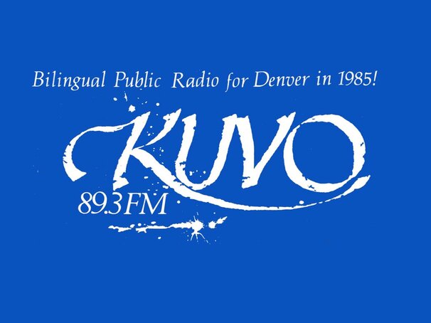
KUVO’s original logo was the product of a contest that was open to the public and also publicized at the Colorado Institute of Art. The winner was KUVO in flowing calligraphy with ink splatterings. It was used on t-shirts, bumper stickers, newsletters, posters, etc. The contexts changed but it was always surrounded by the signature colors – teal and hot pink. Remember this was the 1980s and ‘90s when stoves were also available in teal.
The 1990s was also the decade when KUVO became known as the Oasis in the City. Khadija Haynes, then with the Sherman Hamilton marketing firm had a brainstorm. While taking a break and making a trip to the water cooler, she realized it had many of the same characteristics as KUVO and its music. They were both cool, refreshing, and like an oasis in the desert, offered a place to relax. 89.3 FM truly was an oasis that was located in the city.
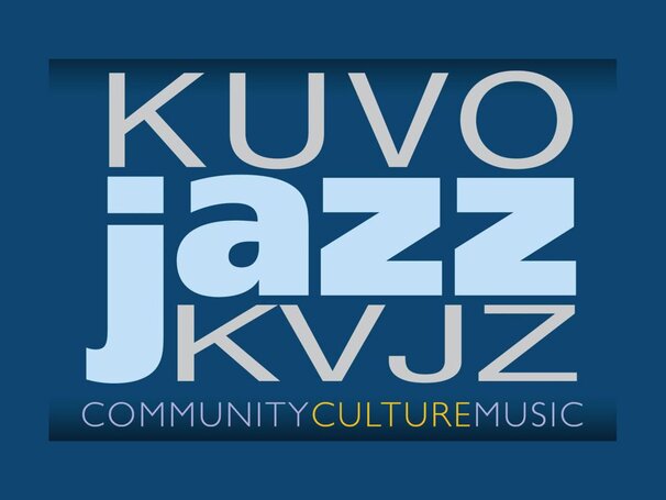
When KUVO was able to have an advertising campaign that included billboards and bus boards, the staff was so excited it had to have a picture. Soon KUVO came to the realization that merely saying “KUVO” did not direct potential listeners to the correct frequency on the radio dial. Remember when that was the only way you could listen to radio? The logo then emphasized radio location and the dominant music style – “jazz89 KUVO.”
Today KUVO has a creative design team that can manipulate the logo for KUVO in many wonderful styles. There is publicity for KUVO via television on RMPBS, electronic billboards and through the generosity of Matt Herzberger, the Jazzmobile.

Stay connected to KUVO’s programs and our community! Sign up for the Oasis E-News today!
